

Having grown up in the printing industry prior to my experience as a photographer, it's safe to say I'm pretty well-versed in colors and their usage. For any kind of visual artist, knowledge of color is an absolute must, even if you're just a black and white sketch artist, you've got color in mind when you shade your gray tones. There is lots of info out there about color, and there are lots of different categories. For instance, you've got primary colors, secondary colors, tertiary colors complementary colors, analogous colors, neutral colors, warm colors, cool colors, calming colors, exciting colors, and tints and shades of all of them to hit everything in between. That's a LOT of color!
Understanding and identifying color is one area of study, but learning how it works in the human brain is an entire science unto itself. Good artists know that the correct pairing of colors can make or break a piece of art, or especially in the case of corporate design like a logo or advertisement. Every day we are bombarded with advertisements in some form or another, and 99% of the time the color schemes and color groupings are as deliberate as the wording. They know that colors evoke certain thoughts or emotions, and they use that in various ways through branding. They put a message into your head about how you feel about something even before you're exposed to the company or product, through the use of color.
Sounds like a bunch of crazy bull? Hang tight and we'll go through this. Take a look at the following graphic that I found online at Think Brilliant: (click it to make it big enough to read)
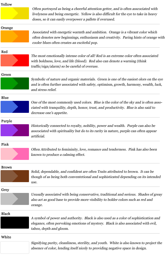
These are the most basic colors and their general meanings/usage. Interesting, no? Let's look at some popular and familiar brands and their logos and see if we can connect the dots.
Starbucks uses green and black in their logo, and when you think about the atmosphere in most of their coffee shops, as well as the global free-trade message they push, it makes perfect sense. The green is calming, easy on the eye, it keeps you optimistic and helps reduce stress. It relates to the reasons people grab coffee on a regular basis. Stressed? Have a cup o' Joe. On your way to work, trying to climb that ladder? Feeling optimistic about work and building your wealth? Need a pick-me-up for some early mornings or long hours in the cubicle? Have some coffee! The black is also a sign of sophistication or elegance. Not just anyone can go and afford a daily $6 morning brew, so you must be special. Do you see how it plays into the psychology of what it is they're selling? Starbucks isn't a product or a brand, it's a lifestyle. It's for people on-the-go who are reaching for higher goals and want to feel a step above the rest yet still down to earth and positive. The white lettering could just be a happy accident, making it easy to read against the deep green, but then again, it could also be a sign of purity, to show how clean and pure their coffee is. Only the best beans from the best sources... I'd say that makes for some good quality coffee, wouldn't you?
Everybody knows UPS, especially if you do a lot of purchasing online, but what most people don't understand is why they're so heavy on the brown. Surely, nobody sat at a board meeting and said "You know what? Our trucks should be brown, and our workers should wear brown, so they look like giant turds ringing your doorbell." Nobody said that. You know how I know nobody said that? Because nobody would ever say that (at least not seriously). For UPS brown is the main color of their brand because it sends a message of being dependable. It's a plain color that not many people use, so it's instantly recognizable, and it gives you a sense of confidence. When you have the option of sending something via regular mail, or UPS, most people pick UPS because they offer free tracking of your package and your shipment is automatically insured for up to $100 for free. Services like that from the USPS cost more money. UPS must clearly be more reliable, right? I mean, they're putting it all out there. If the glass rose you bought for your wife gets broken in transit, they'll buy a new one! If it gets lost in transit, you'll know exactly where it was last and when they plan on getting the delivery right! They're dependable and solid, you can rely on them to get the job done! Again, all about the colors in the logo.

Ah, Harley Davidson, one of the great American brands. Well, we already know that black is about sophistication, and we also know not everyone can afford a Harley (they are the price of some small cars!). Black is also a symbol of power, and that's what you get when you sit on a 1200cc bike. The orange signifies enthusiasm and energy, and in this particular case when you pair the power of the black with the enthusiasm of the orange, the message starts to come together as "This is for people who like power and a little bit of danger in their lives." The white lettering in the middle may or may not be intentional; it could just be knock-out type for ease of reading, or it could, in this case, be symbolic of youth, as in being young at heart.
I guess I'll keep with the transportation theme here and point out the Ford logo, which has been either a solid blue or a blue gradient since as far back as I can remember in my childhood. Pretty basic right? What does blue stand for? Well according to the chart above, we know that blue means "honor, trust, and productivity" among a few other things. Since Ford is an American company, of course they want you to feel good about buying a domestic brand, so the productivity fits perfectly: you're buying within our own economy right here at home! The honor and trust are strong too, though. I mean, buying American brands in America is great, but it's gotta last right? You have to trust the car or truck will last, and there needs to be a sense of honor from the company providing it. This is where the color ties into their slogan "Built Ford Tough." There you go, they claim to be built tough, and the logo is a cool, calming color, that is both masculine and reassuring all at the same time.
I could go on, but I'm sure you get the picture. Go and look around the next time you're shopping or driving down the highway. Take note of the logos and the advertisements and billboards and see if you recognize any common themes with how they use color for their brand image.
That's it for Part 1 of this entry. Check back for Part 2 where I'll explore how I've used color in my own work to evoke certain feelings or thoughts, and how it plays a role in entertainment as well. Subscribe to the blog using the link on the right to find out when Part 2 posts, or follow me on my Twitter or Facebook accounts for regular updates.
**UPDATE** Part 2 is now available.
More soon,
-Rob


No comments:
Post a Comment